INTEGRATIVE MEDICINE OC

ROLE
Product Designer
TIMELINE
2 months
SKILLS
Design System
Documentation
Integrative Medicine OC is a growing healthcare clinic that needed a system to support their scale into longevity care, a future supplement brand, and the marketing between them.
What shipped is a token-based system live in Figma and code. Claude gave the build speed, but every architectural call stayed mine.
CONTEXT
Integrative Medicine Orange County (IMOC) treats patients with both conventional and functional medicine, where trust is the product. Most visitors arrive with the same two questions: can I trust this clinic, and do they treat what I have?
3,000+
MONTHLY VISITORS
checking if the clinic is a fit
100+
PATIENT LEADS
generated every month
66%
ORGANIC SEARCH TRAFFIC
often arriving for the first time
I was brought on for a standard website audit. The brief grew to cover the clinic site scaling into longevity care, a future supplement brand, and the marketing that draws from both. It all needed one foundation.

PROBLEM
I inherited a basic brand guide of six colours and a loose set of logo rules. No spacing scale, no type scale, no component logic.
I opened the site and slowly started looking around.
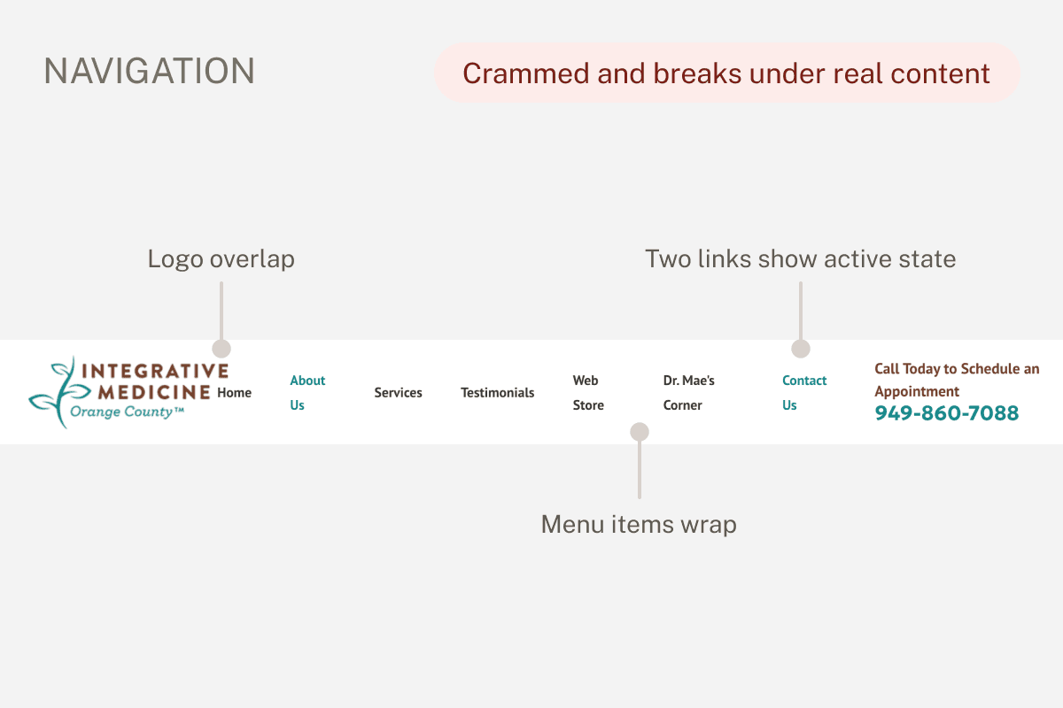


None of these on their own would sink a first impression. But together, they read as a site nobody was actively caring for, including prospective patients who would rely on it most.
Each fix meant a new decision with nothing to check it against. So I stopped fixing pages and started building what should have ruled them from the start.
DESIGN PRINCIPLES
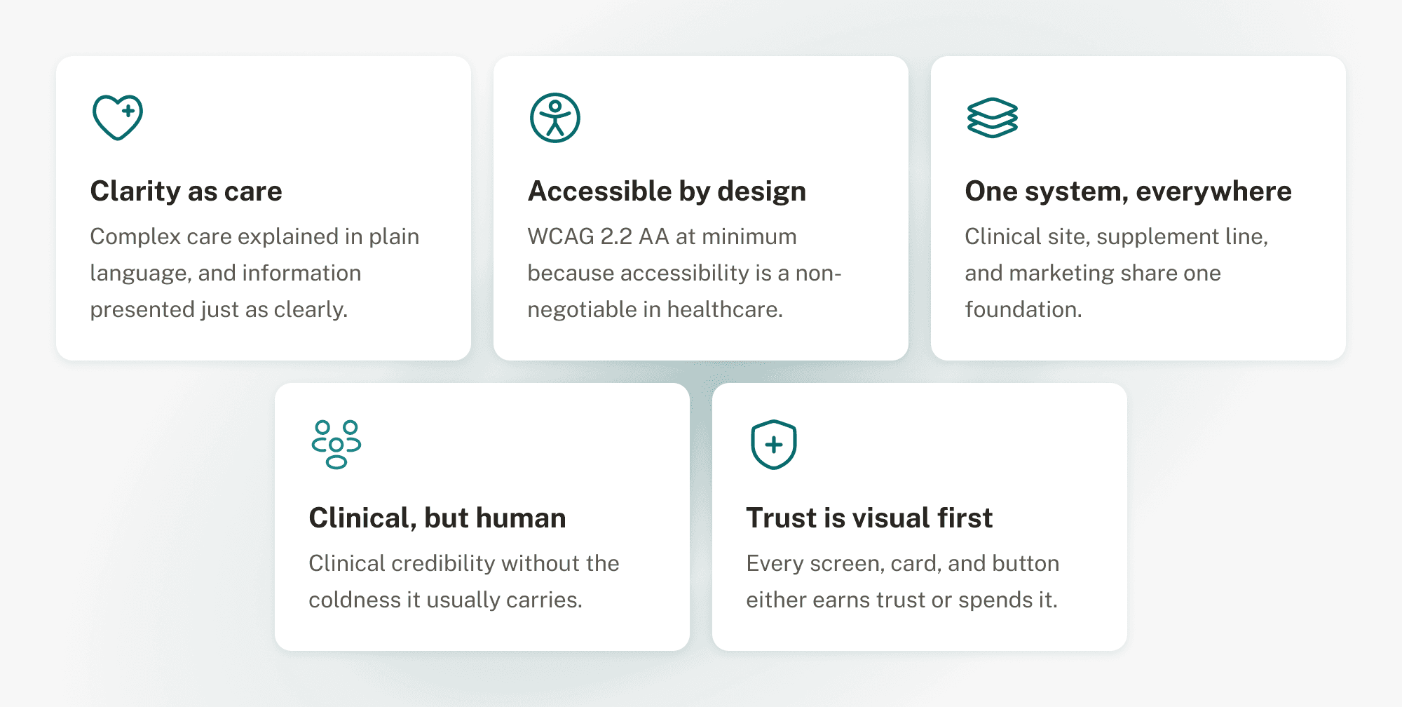
Six colours and a logo weren’t a design system. They couldn’t tell me what a hover state should look like, or how the site should speak to a potential patient. So I wrote five principles, one standard to check every decision against.
FOUNDATION
Two things had to be true for this system to succeed: it needed foundations that made decisions once instead of fifty times, and it needed to live somewhere other than Figma.
Six brand colours with no structure. Three were different shades of a similar brown, so I collapsed them into one ramp and rebuilt the rest into tokens, each pairing checked against WCAG before it shipped.

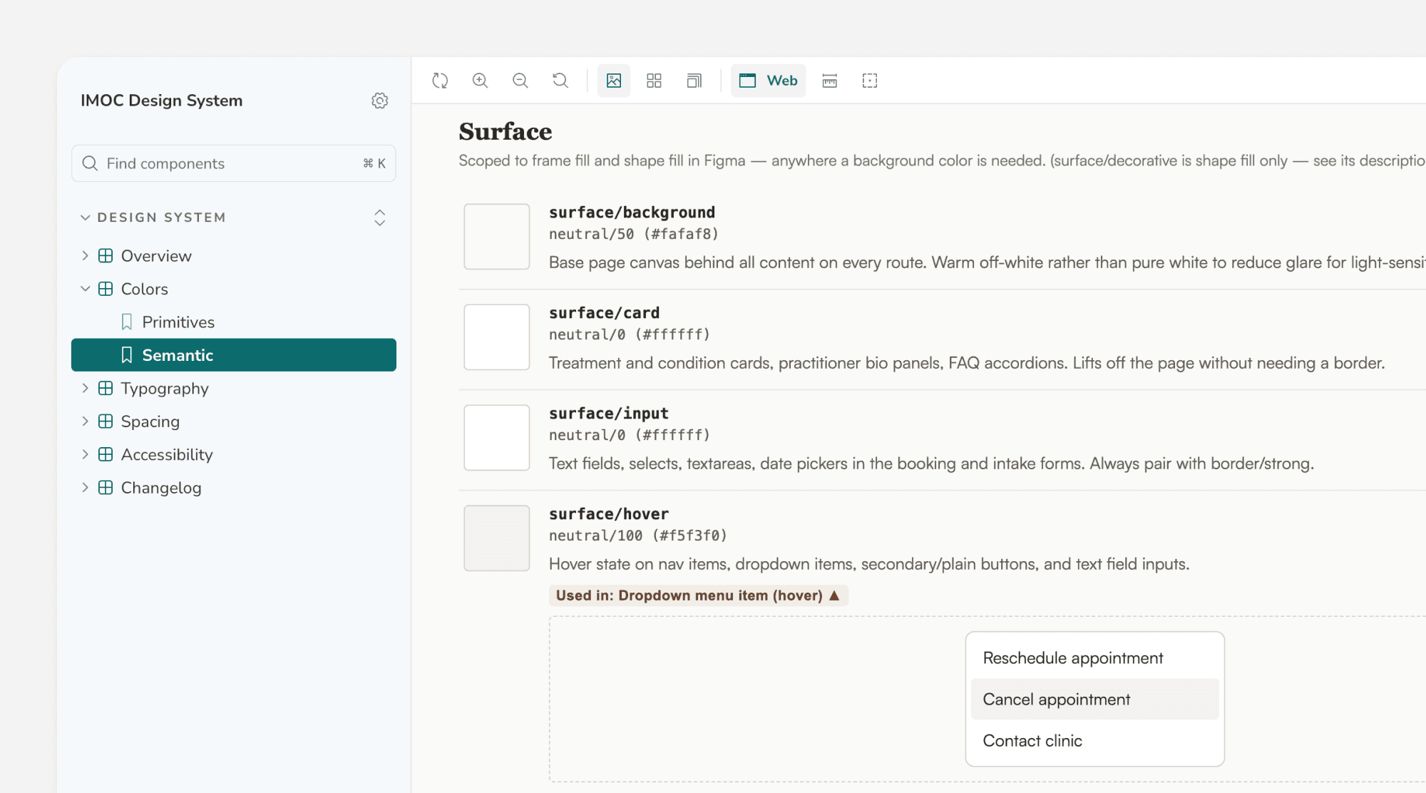
Design tokens meant every colour decision only had to be made once. Semantic tokens describe intent, not appearance, so a token can be redirected to a new primitive without being renamed.


The old font pairing read closer to a software product than a medical clinic. I moved the system to Fraunces for display and Public Sans for body, fixed a scale for both, and gave mobile its own steps instead of shrinking desktop values.

An 8px scale with 4px micro-adjustments applied to padding, gaps, and margins. Corner radius follows the same logic. Spacing stopped being a per-component guess.

40+ components, built highest-use first: navigation, dropdowns, cards. Every one is on auto-layout, fully tokenised, and covers its interactive states, including the hover states the original site never had.

TECHNICAL PIPELINE
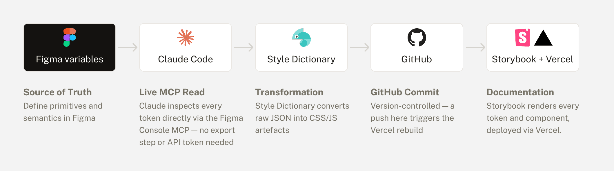
Once the visual foundations were set, the system had to become deployable code. Before this, updating a token meant copying values from Figma into code by hand, with no way to know if a file had drifted until something looked wrong.
AI WORKFLOW
Claude is only as useful as the context you give it. Before asking for anything, I fed it six files: project instructions, patient personas, design principles, platform constraints, and design system best practices.

With the Figma MCP connected, I built the foundations in order, colour, typography, spacing, radius, elevation, layout. Every semantic token got a written description covering when to use it and why.

Claude Code ran in parallel on the repo, reading across the codebase, editing files, keeping Figma and code aligned as the system grew.
I kept three systems open through the entire build: Nord Health for healthcare-specific reasoning, Atlassian for scale and token architecture, and Polaris for its staged component model.
That running comparison is what told me when to push back on Claude's output instead of taking it as given.
OUTCOME
Primitive and semantic tokens are live in Figma and mirrored in code. The foundation the redesign needed from the start now exists, and every new page starts from a decision instead of a guess.
Accessibility used to be a checklist at the end. Now it's built into the token layer itself. If a colour pairing fails WCAG 2.2 AA, it isn't in the semantic layer to begin with, so there's nothing failing to catch later.
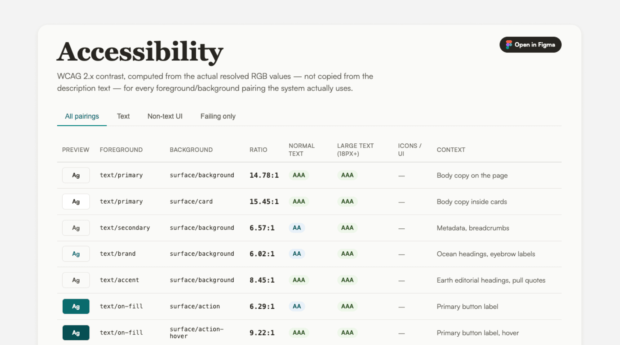
The documentation is built in Storybook, and explains what each token is for and when not to use it, so extending the system doesn't mean re-arguing decisions that are already made.
The next test is putting it in front of someone else: a designer extending the system or a developer implementing it.
REFLECTION
Output still needs checking
Claude built the structure fast. Whether it was any good took checking it against systems that already worked.
Learning while building
I learned design systems by working through naming conventions and token structure, asking Claude when I was unsure.